It’s estimated that as many as 70% of shoppers make their purchase decisions in store, meaning that no matter how much marketing and advertising your company does, most shoppers can be dissuaded to switch brands at the point-of-sale.
Because of this, product packaging and labeling is more important than ever, as this is the primary method by which most consumers can be persuaded (or dissuaded) to purchase your product at the point-of-sale.
The question then, is how do you create an effective label for product retail? I mean, what exactly makes a consumer choose your brand over the numerous other brands on the same shelf?
It’s a tough question and although I certainly can’t hope to answer it fully in this post, (or any post, for that matter) I have created a simple, two-step process that I believe serves as a great base for anyone looking to design a product label.
Step One: Be (Very) Different from the Competition
The golden rule of product label design (especially in retail) is to be as different from the competition as possible.
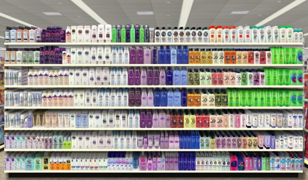
If you take a look at this image of a typical supermarket shelf (below), the reason for this will be instantly obvious.
Source: http://www.rdginsights.com.au/archives/567
As you can see, the products in this example are beauty products (i.e. shampoos/conditioners) and clearly, there are a lot of competing brands.
You’ll also notice that these products are utilizing their product label(s) in various ways, in an attempt to differentiate themselves from the competition. The hope is to attract the consumer to their product in-store.
Here are just a few ways these brands/products (and others) attempt to different themselves:
Color
If you were in the supermarket with no prior knowledge of any of the brands on display (in the shampoos/conditioners image above), which product would you pick?
For me, it would likely be the green one, as that one appears most different from the competition (i.e. surrounding products) and instantly jumps out at me on the shelf.
The reason for this is primary due to the colour of the product (i.e. bright green).
It’s clear that this brand is using colour to differentiate itself from the competition; the bright green label is clearly the colour that stands out most on the shelf (with the purple/blue products coming in a close second).
Source: http://www.itv.com/news/2015-06-10/introducing-the-dausage-the-sausage-and-doughnut-hybrid-that-may-be-coming-to-a-supermarket-soon/
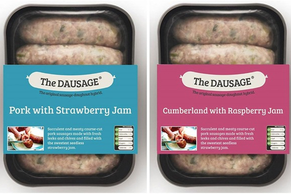
It’s a similar story with these product labels for sausages (above); the brand is utilizing bright colors to stand out from the competition on the shelf.
The trick here is to ensure that the color of your product label stands out not only by itself, but when surrounded by competing products.
If your competitors all utilize bright colors (e.g. bright green, pink, etc.), you’d actually stand out more with black/white product labels.
Tip: If you’re retailing products in jars or other clear packaging, you can actually use simple clear adhesive labels (which you can buy at Fast Labels) to allow the natural colour of the product to shine on the shelf.
Typography
Never underestimate the power of typography as besides utilizing color, typography is a great way to differentiate your product(s) from the competition when designing product labels.
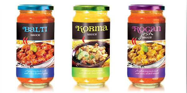
For example, let’s take a look at the product labels on these jars of curry sauces.
Source: http://www.openatpublic.com/customercentricagencyapproach/fmcg-packaging-design/
You’ll notice that the product label uses a rather unique typeface, the style of which is relatively common in Indian culture.
It’s this typeface that helps differentiate the product from the competition, as it gives the product an authentic feel, which is often a great selling point in the food/drink industry.
Source: http://www.creativeguerrillamarketing.com/advertising/5-essential-packaging-design-tips-smaller-brands/
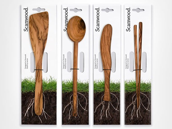
Conversely, the font used on the back labels of these utensils gives the product a premium, upmarket and high-quality look and feel. This is primarily down to the use of a simple, elegant serif typeface.
The bottom-line: remember to consider your typography when differentiating your product labels from the competition.
Photography/Images
You can also utilise photography and imagery on your product labels to help differentiate your product/brand from the competition.
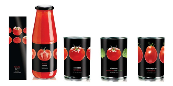
For example, take a look at the product labels on these tins of tomatoes:
Source: http://www.openatpublic.com/customercentricagencyapproach/fmcg-packaging-design/
The labels feature a stunning image of a tomato (and basil leaf on one of the products), which not only helps to ensure that the product stands out from the competition on the shelf, but also gives the consumer reassurance regarding the ingredients contained within.
It differentiates the brand by saying, “these are the only ingredients in this product; there’s no preservative or other nonsense, just tomatoes”.
This is the selling point.
Tip: Remember to make your photography/imagery in some way different from the competition, otherwise you won’t stand out.
Step Two: Tell Your Story
Now you’ve managed to capture the attention of the consumer (which is at least half of the battle), you need to seal the deal by telling your story and resonating with customers.
Your product label is the perfect place to do this.
It’s important to realize that “telling your story” doesn’t necessarily mean boring the consumer with every single fact about you, your company and your product; it means to tell a story that makes them want to buy.
You can tell your story in numerous ways: using text, imagery, fonts, colors, or even a lack of any of those things.
Source: http://www.creativeguerrillamarketing.com/advertising/5-essential-packaging-design-tips-smaller-brands/
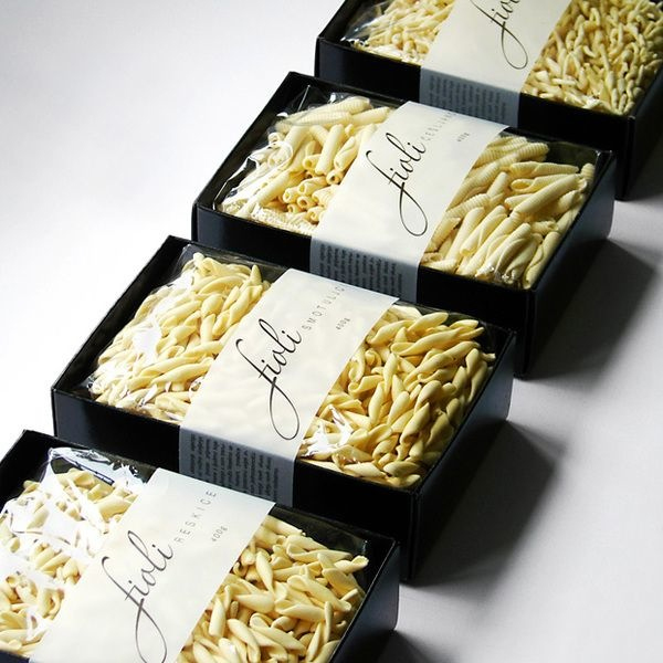
For example, this pasta brand (pictured above) tells its story with a super-simple product label containing nothing more than the brand name, the name of the pasta type, and the quantity (in grams).
It’s the lack of information and clutter that tells the story here; it says, “We care about producing a quality product; that’s what we’re about and nothing else matters”.
It’s likely that this “story” would resonate with a particular type of consumer (i.e. the company’s target market).
Source: https://amysmartalpha.wordpress.com/tag/logo-design/
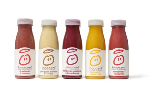
It’s a similar story with the product labels from Innocent Smoothies (above); the labels tell the story of the brand and what it stands for in a simple yet efficient manner.
The labels tell you exactly what ingredients the product contains, and each label features the company tagline “pure fruit smoothie”. Aside from this, the labels are predominantly white.
This combination tells a story of a brand that cares about the ingredients they put in their products, and are proud of their commitment to simple yet delicious recipes.
It reassures the customer that no additives, preservatives or other “junk” are in the product, without even saying a word.

This is some great advice, I especially like some of the things you’ve said about using color and typography in designs. Honestly, you’re not only competing with the other products on the shelves, you’re also trying to get the attention of customers as they pass by. Proper use of bold colors and attractive typography can help your labels stand out, especially if they’re going to be applied to a smaller product to begin with.