 Let us just think about some of the major gladiators in the business world arena. The first companies which come to mind either belong to the Forbes 500 list, or they are well-known and reputed companies, with a notable market standing.
They provide top quality service, excellent products and goods and which have their own particular space in the cutthroat world of big business. Warren Buffett called it “economic moat.”
Think IBM, Samsung, Nestlé, McDonalds, KFC, and other globally well-known brands.
How did they manage to keep their position ahead of their competitors? Yes, we know about the convenient services and top quality products that they have been giving us for many years. Apart from that, they have a multi-million dollar budget for just advertising and advertising alone.
So, have they managed to garner more prospective clients through their websites? Well, the jury is still out on that one. You may have noticed that many of these global names have not managed to make their names through Internet marketing or online website presence. Where did they go wrong? Lets look at some recent and early examples from these companies, and see what worked and what still doesn’t.
Remember that the first impression your website gives to a prospective client can make all the difference between the client staying on and browsing through your site or clicking the mouse to go to your nearest competitor within clicking distance.
So, here are the Top-10 Website Design Disasters Affecting Your Business:
1. Too Much Clutter
Go online and look at some of the most successful websites on the Internet. Let us talk Wikipedia, and even Google with its clean, uncluttered appearance. Then there is MSN which comes in the “cluttered” category. Let us compare Google with MSN:
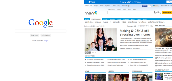
I have the option to put my own wallpaper on Google, through Tools and add whatever I want on it. But frankly speaking, MSN scares me, because of the immediate inundation of so much information, and so many pictures, and links and stories. If that’s not enough, there is more just around the corner as you scroll down.
I do not know about you, but I visit MSN very rarely. One may call it excellent web design because every single news item is in its proper fixed place, but I call it “clutter”.
2. Still Using Flash?
My apologies to the owner of this website, but then this can be considered to be top free publicity! It’s certainly not a Fortune-500 company either.
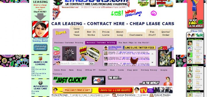
But the moment I went on to this site, my eyes and ears were overwhelmed with advertisements in FLASH, telling me to click, while I watched the hen revolve in a mind numbing circle. And then the music came on. That was enough to send a squeaky message to my brain saying “click click click, get out of here as soon as possible”.
Teenagers and kids may enjoy the psychedelic lights, but how many of them are hiring and leasing cars? So keep the targeted potential client group in your mind, when you are getting your website designed.
3. Too Much Visual Content is Confusing
A few years ago , I was simultaneously designing the mockups for three clients in Photoshop, FireWorks And Illustrator. I did the mockups before I coded them in Dreamweaver. Here they are, all of them totally different from each other. If you were in the place of the clients, which design would you choose for your site and why?
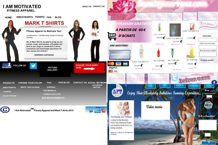
As a totally unbiased viewer, looking at these three dummies, my first instinct would be – hey, get away from the Beauty for You site. It is just over cluttered with items and the design is also rather psychedelic.
4. Content is King. Or is it?
We all know SEO is critical. But how often do we need to change the content on our designed websites? Well, the answer is at least once in a month, so that Google knows that your website is not stagnant. Also, new content means that Google is going to find rich new informative content, new keywords, new phrases, and other meaningful content in your site. That means more visitors have more options for keyword search, when they are looking for your particular products and services.
I am glad to say that Coca-Cola has recently designed a clutter free site – just the homepage, – but the rest of the pages come in the “Huh, what is this?” category.
For example, when you click on the brand page, you would want to learn something about the nutritional information of Coca-Cola. Or perhaps you even expect to learn something about its brand, its history, or anything useful like Constituent ingredients [caffeine, corn syrup et al ] or even Coca-Cola based recipes. Well not really..
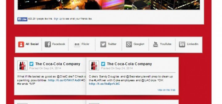
Instead, we get page filling content with Coca-Cola promoting outdoor hiking among youngsters and joining in discussions about how worldly libraries making a big difference in communities across the world.
All right, so a bottle of Coca-Cola is subconsciously associated with the drink you drink when you are reading something, but this is their way of adding fresh new content to their pages? Just going online, picking up a socially relevant subject, – which has absolutely no bearing with their company, but has some social or local significance – and putting it on their webpage?
Well, this is one way of marketing, but I consider this to be web stuffing for Google search Bots with irrelevant content. Unfortunately, a number of companies are doing just this, online today.
5. Are Your Servers Working?
There are other top company sites which show you that poor glum little emoticon telling you that the page cannot be loaded because there is a problem with the server, or any other reason. The normal attention span of the Mr. A.V. Rage Joe out there is less than three seconds. He is not going to sit for 10 seconds for your page to tell him that he needs to reload the page again. Instead, he is going to describe your website in colorful language and go browsing again. So there you are, your potential client has just slipped through your fingers.
Here are some more reasons why plenty of websites Bomb Out in the This Website Is Really Impressive game.
6. Too Many Sliders and Pop-ups
I am concentrating on the interesting content on a particular website. Suddenly my mind subconsciously registers an uncomfortable thought – what moved and where? Actually a generic picture in a slider just changed because 10 seconds had passed and it needed to put on the next smirking pretty face on screen.
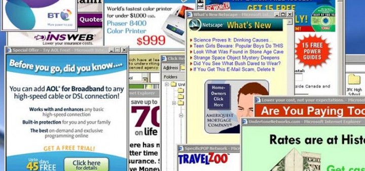
So here I am – do I read the content, or do I look at those Pretty Young Things? While I am making up my mind, up pops a pop-up box telling me to register, subscribe to their RSS feed or to their newsletter, or advertising some of their products.
And the problem here is that I cannot remove these annoying pop-ups. Even clicking on the close button is going to load up a page willy-nilly. Any company playing this sort of nasty trick on me, does not get my custom or even Goodwill.
7. Splash Pages
What is a splash page? This is the Internet’s snobbish way of saying, “Well, we know you are standing in line, but we need to allow you onto our website, after you have waited a while. If you have done that, that means you really want to visit our website. If you have gone away, who cares? It is possible you could not afford our Branded products or services.”
So instead of taking you straight to the homepage, you need to go on a splash page, according to them. There are some buttons there. Click on them and you are ushered into the site’s homepage, where you may have to wait a few seconds before the home page loads onto your screen.

Adios amigos, I have better things to do with my time, than press enter, and then wait for about 60 – 80 seconds, while the homepage loads.
8. Jumping Through Hoops
How many times have you visited a website, with long forms and drop-down menus telling you to choose from all their products? Or how about before you can register a complaint, or know more about that product, product information, or the price list?
The old Sony products site wanted to know your location. After that, it sent you to that particular area’s webpage. If you want to complain about a product you need to know its type, number, and to which category it belongs. Many e-commerce sites – and even other sites – fall down on their job, especially when a potential client wants to click on the purchase button. If they come up with a page which refuses to load, or face the frustration of typing in lots of information they won’t stay.
Goodbye, dear website of XYZ company, we do not part friends… I shall not visit your site again or buy your products. Do not let that happen to your company website. Good customer care makes good long-term future loyal customers. Irritated customers avoid you, and spread the word!
9. Cookie Warnings
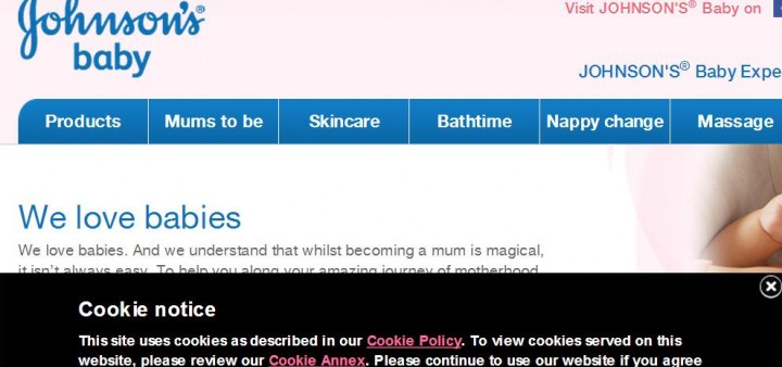
Johnson and Johnson may be one of the largest multinationals in the world, and I’m sure their advertising budget is in the billions. But, I disregarded the cookie popup on their earlier site, because there are very few sites who ask for your permission before they put in their cookies on your computer. A majority of them out there, take it for granted that their cookies are going straight To Your Temp Folder, and who needs your permission?
10. Complex Navigation
[adsenseLeft]
Remember – do not make your navigation bar so complex that even a five-year-old child cannot click on the Home button. But if you intend your clients to know more about your company’s history, aim, goals and business motto, and place all that information on a “miscellaneous” or “brand” page on your navigation bar, well, that is your outlook. But do not blame me if they are conspicuous by their absence.
I was looking on the Internet at the different designs out there. I saw a site where the navigation bar was not present right in front of my eyes on the screen. You need to keep in mind that 99.9% of the average browsers on the Internet have a subconscious idea of where the navigation bar should be. Right in line with their nose when they look at the screen. Or maybe a bit further up. Or maybe on the right side of the screen or the left side of the screen, well within clicking distance of a mouse.
But this particular website had the navigation bar, right where another web designer would put the copyright footer bar. I needed to scroll down to reach the navigation. Needless to say, I was not in the mood for scrolling down, and left the page midway. So keep the navigation user-friendly and simple.
Conclusion
These are just some of the technical and common sense tips and tricks, and user-friendly suggestions, which you would want to incorporate in your website design. Remember that the average browser on your site does not want to wade through miles and miles and piles of files in the shape of information overload.
So take full advantage of these pitfalls and tips when you are designing your site and look out for High Visitor Traffic…

Very interesting topic and all the points are absolutely right. As an optimizer and online marketer I am been always responsible for getting more conversions and sales. Websites like these, with lots of ads, popups, flashes, cluttered designs and too much content, are always scary to people and mostly do not convert. Navigation is another big issue for big websites, portals and eCommerces. Easy navigation is good for conversions as well as for optimization and ranking.
Loved reading this article and going to share this with my groups. Keep on coming more like this..
Thank you Soumya, for your appreciation and comments, especially when you said that you intend sharing this URL with your groups. Again, like I said, a clean Interface, easy navigation, no Content Stuffing and not many irritating pop-ups are going to get a more positive consumer response than flashing colors and psychedelic stars.
Really, all of the things you’ve mentioned can be disastrous for a website. These can dramatically reduce the number of website visitors.