 Navigation is also known as button bar, which is an essential component of a website. The success of a website is directly related to its navigation. Website navigation is like a gateway into the different sections of content. Some general rules are mentioned below to design it effectively:
- Navigation should be easy and simple
- It should be consistent
- Less is more
- Remind the user of their locationUse obvious section names
Navigation is the first thing of which extra care should be taken irrespective of the functionality of the website. The website with wonderful functionality along with an exceptional navigation will be impressive and interesting for the visitors, thereby giving an enhanced user-experience.
Few websites with marvelous and distinctive navigational elements are showcased below, which is a sign of how websites should be with a combination of novelty and realism:
Examples Of Website Navigation
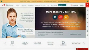
CSSChopper
CSSChopper offers a rich and colorful approach to website navigation. A traditional menu bar is situated across the top of the page, but user’s eye is immediately drawn towards the below-mentioned rich and user-friendly content that describes it’s services. A basic approach is adopted, but it is an effective solution for communicating the core information.
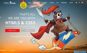
HTMLPanda
HTMLPanda is a well-designed and colorful approach of website navigation. An inspirational pic is added on the home page with precise & user-friendly content. It is a brief description that communicates the core information regarding its excellent services.
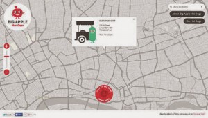
Big Apple Hot Dogs
This is a quirky site, which uses minimum navigation in order to create a simple and clean interface to display the content and product.
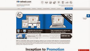
No-Refresh
No-Refresh website really encourages users to click due to its simple and impressive website navigation. With the help of this website, they done the easy exploration of work and philosophy. The site is not boring due to bright splashes of colour along with some pleasant layout surprises on the screen.
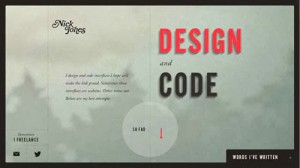
Nick Jones
A simple and minimalist approach to website navigation is adopted by Nick Jones showcasing a menu of options in the center of the page in a straight line.
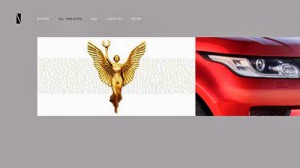
Niketo
The website of Niketo has adopted a timeline-like approach in order to show the content. It has a simple-but-effective pop-up menu with the help of which you can filter the content that is shown
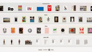
75B
The website navigation of Dutch studio 75B uses a bird’s-eye-view approach. In this, the content is shown from high level. A horizontal scrolling page is revealed at full size on clicking on any one section.
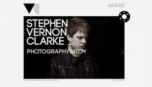
Stephen Vernon Clarke
Stephen Vernon Clarke is a simple website for a photographer that uses a dial metaphor in order to provide the website navigation between sections mirroring the functionality of a camera. With the help of this ultimate solution, the photographer’s work is permitted to take a center stage.
Nimbletank
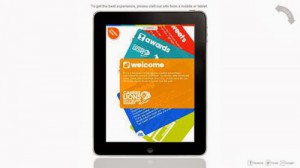
Nimbletank offers a fun and interactive experience to users with a 360 degree movement and references of old school Tetris game. This site is aimed at touch devices, but it is also functional on desktop screens. In the corner of this site, situated a rotate button to mimick the rotation of an iPad.
Acko
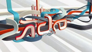
This site is unusual in its minimalist navigation. This site impress the geeks with its rich 3D effect that is rendered directly in the browser in which the site sweeps from one section to other.
About the Author
 David Meyer is a web graphic designer and has years of experience in this field. He works at Webgranth, which is a top-rated service provider company. His biggest passion is blogging and so, he also writes for other blogs.

vwey useful information… thanks for sharing