 Responsive web design is an approach to web design in which a site is developed in such a way that it provides optimal experience across wide range of devices (from PC to mobile phones). It was probably most popular trends since last year in web industry. Building layouts for the web can be tough, but inspiration is a huge factor. In this showcase we’ve collected 25 amazing responsive websites. All these designs are built to support almost all types of screen resolutions and devices. So let’s begin!
Before you start you may like to read our previous articles about:
- A Collection of Beautiful Design Agency Sites
- 21 Web Designs Having Beautiful Typography
- Showcase of Amazing Website Navigation Designs
- 40 Inspirational Examples of HTML5 Websites
- 35 Inspiring Examples of HTML5 Websites
Examples of Brilliant Responsive Web Design
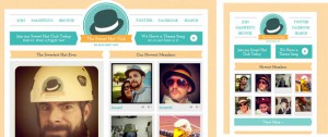
Sweet Hat Club
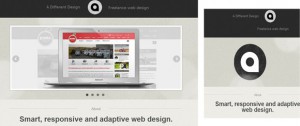
A Different Design
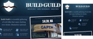
Build Guild
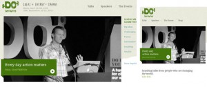
Do Lectures
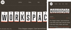
Trent Walton
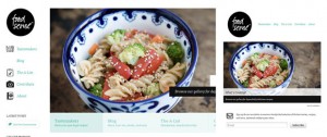
Food Sense
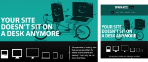
Sparkbox
ribot

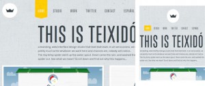
Teixido
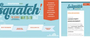
Sasquatch Music Festival
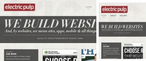
Electric Pulp
Stephen Caver

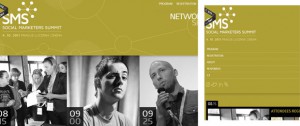
Social Marketer’s Summit
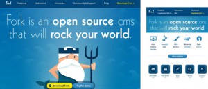
Fork CMS
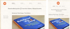
SimpleBits
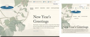
White Lotus Aromatics
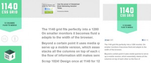
1140px CSS Grid
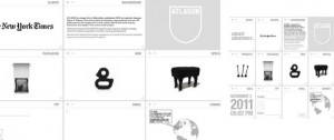
Atlason
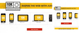
10K Apart
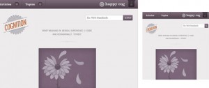
Cognition
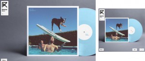
Reverse Buro
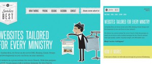
Sunday Best
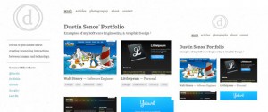
Dustin Senos
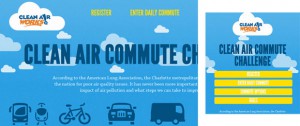
Clear Air Challenge
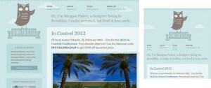
Owltastic
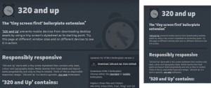
320 and up
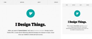
Yaron Schoen
Let us know your thoughts or questions in the post comments area.
As more people are accessing the web on mobile devices, websites are going to have to become even more creative with their use of responsive design.
I particularly like the use of that yellow-gold on the 10K Apart, it’s not a colour that you see used very often.
nice, you should also check this out http://www.wowthemes.net
Great source of inspiration. I love seeing the ones that aren’t agencies/developers – as they are much rarer for the moment. Perhaps this will change in 2013 with greater adoption and realisation that it’s the way forward over a mobile site.
We’ve just launched our own responsive site and are very happy with it (although we too are an agency!) http://3seven9.com It’s taken us a few months to get it how we want it but we’re convinced it was definitely the right decision for SEO, for a showcase and simply to keep up with this industry’s ever-expanding trends.
Really nice list — Always looking for design inspiration.