 Gone in less than 60 seconds? This is the trauma most of the web designers are suffering from. Most of their visitors navigate away from their sites in a very short span, literally at a blink of the eye. Today’s viewer belongs to the jet age. No one has enough time to spare. A half a second more for the website to load makes the user lose interest in it. The viewer is fast, zippy and impatient. So what do you do get the viewer hooked?
The only solution is to have a center of attraction viz. focal point in your web design. Focal point grabs the attention before the user navigates away. The focal point is the eye-catching centerpiece of the page; it stands out and is distinct than other components.
The basic thumb rule: The focal points hold on the attention of the user and the main idea of the website is conveyed with it.
The basics
Too many cooks spoil the dish, in the same way; too many focal points will spoil the design. Get the basics intact. Have only one center of attraction in your design. What should be that one attention seeker depends on your goals and priorities of the website and the expectations of the website’s owner. But one is sufficient.
Having more than one center of attraction is much like having none. However there can be two attention seeking points, out of which one should have a call-to-action. And doing so would also mean that the two points should be very much distinguishable by the user.
Differentiation can be created in many ways. The difference can lie in its positioning, color, size, graphic or even text. But before you implement it, do have a unanimous person judge the design.
So where should be the center of attraction?
The most expected of reply would be to set on the homepage. And it is arguably the best page to get the visitor hooked. But creating a center of attraction on the landing page is the most common mistake done repeatedly by designers. Every page should be given importance and every page should have one center of attraction.
On a non-scrollable page (i.e. a page that is visible all at once), you have more to experiment. Use the existing elements, but use them well. Make something simple elaborate; make something ordinary yet impressive.
On a scrollable page, for example, put the focal point above the fold (the header is a good candidate location).
If you can imply a narrative. Unfold your design with a story.
Ways to create the attraction point
The human brain is a magic world. Everything and anything can be possible. And with the modern day tools, getting attention won’t be that difficult. Here are some real-world examples to help you with it. Make sure you create something new & impressive by mixing them up.
Typography
Tried and test formula. Typography has always grabbed the attention. Use the right blend of colors, sizes, spacing and create something appealing. Remember, it’s the beauty that attracts first.
But there are many websites crowded with typography but unable to catch the attention. So stick to the basics of emphasizing on just the main and important point.
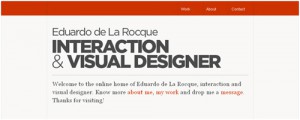
Eduardo de la Rocque uses dissimilar typefaces and sizes to make three level of visibility.
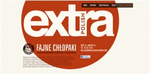
Fajne Chlopaki uses a huge typography that is really eye-catching.
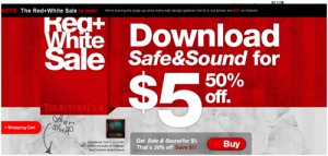
Music band The Autumn Film declares their special offer with bold type, creating a true focal point.
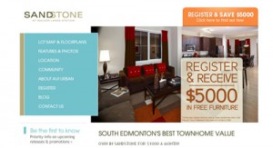
Websites such as Sandstone proves that good labeling provides a captivating focal point.
Using different font sizes can do a lot, but colors are what really grab the visitor’s attention. The header on the website for Flash Gaming Summit 2011 is a good example of this.
Illustration
A picture speaks a thousand words. Graphics are easy to understand for the user and explains everything in just few seconds. Just the way people want it these days. It can be descriptive as well as informative. You can even use it to make a complex task look easy. But excess of everything is bad. So save them for the right moment and don’t overuse them.
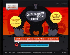
The home page for Bet Your Followers has several focal points, but the main illustration of the gorilla image is principal and guides the eye to other points.
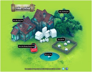
Aka-Acid has a beautiful design, yet need more particular focal point.
Buttons
The other prominent and widely used graphic option is the use of buttons. They act as call-to-action buttons. Most of the websites have them and is widely used because of its huge size and visible dominance. Trying this method won’t be harmful until you overdo it.
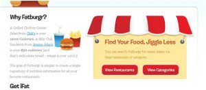
Into Fatburgr, two simple buttons catch the user’s attention. Their size and color are much effective.
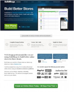
SolidShops uses clear and noticeable buttons to create points of attraction, both above and below the fold.
Whitespace
Using whitespace is one of the simplest ways to draw the eye to specific areas of the page without resorting to visible elements.
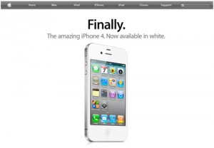
The most popular example of effective use of whitespace is Apple, Inc. This website uses whitespace perfectly to make the featured product noticeable.
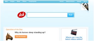
There is good and enough whitespace around the search box into Ask.
Decoration
If it isn’t served better, then it won’t be accepted well. An easy way to distinguish it from the crowd. Mix and match the various elements in a way that the elements don’t just taste good, but look good as well.
3rdM is the simple but very effective example as it immediately attracts the attention using blue icon.
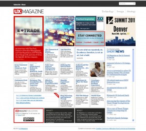
UX Magazine has several points of attraction on different levels.
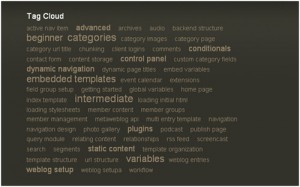
Tag cloud used by Train-ee, is an excellent way to arrange focal points by sizes.
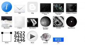
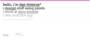
Dan Viveiros is a minimalist and elementary website but have some effective focal points.
The last word
Every website should have something interesting to offer. Unless then, everything isn’t worth it. We have emphasized on the various elements observed in the web world, but a lot is yet to be explored.


A very informative article. Thanks for sharing your knowledge with us. I will definitely keep these points in my minds while creating websites.
The header for the Flash Games 2011 Summit makes me want to just skip reading it altogether and move on. Too jumbled, too many different fonts, too many different colors, the nav menu is difficult to read. The whole site is rather garish to be honest…
Great post… I always struggle on this kinda stuff, but this was helpful.
Thanks.