 When you are creating a web layout (or hiring a web/blog designer to create one), there are specific things you should to be aware of. These things normally wouldn’t touch your mind. For almost every person who want to a website/blog for their business, there a definite thing – sale of their product or service. Now, they may want a big flashy logo, overuse of texture or gradient, but the job of an expert designer is to drive their client in the right direction. Here are 20 do’s and don’t for effective web design. Don’t hesitate to let us know of any other points that are left by us. We appreciate your opinion on our articles.
Do: Keep your page well structured
In recent years, designers are using grid systems and CSS to structure their web designs. It is quite great way. This way will give a well structured and balanced layout for your magazine styled website, as well as help to manage information flow in structured and easy format.
Example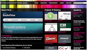
Don’t: Just placing boxes everywhere within web layout
There are many websites that have several boxes having different sizes and nothing lining up properly. If you are a web designer who doesn’t place elements in a structured environment, well you are into a cyclone of craziness.
Do: Focus on what is more important
If you are building a website for a business that sells a specific product or service, then you should really focus on homepage. Inner pages should have calls for action for that specific item. If you are building a blog that offers freebies or writes tutorials, make sure that they’re getting the proper focus and attention. Websites like WOO Themes are great examples of focusing products – WordPress Themes.
Example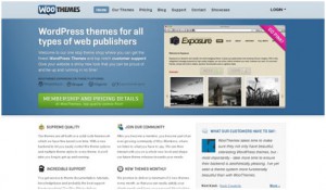
Don’t: Placing irrelevant ads across web pages
If you are going to try and make money through your blog/website, just stay away from excessive advertisements. If your page has 75% ads and only 25% content then visitor will leave and will not come back. Your content should a highest priority element on web page.
Do: Choose the right and effective color scheme for web layout
Knowing what your reader’s sentiment is will help you to choose the proper color scheme for your website. It is not sophisticated to use bright and loud color scheme if your website is under meditation category.
Example
Don’t: Overdoing color scheme with numerous and different colors
All colors used should blend well together, not conflict. If you are not so good at picking color schemes, refer sites like Colour Lovers which has user generated color schemes collections. Search out the right color scheme (at most, 5 colors) and see how much better your designs appear.
Do: Make it easy to locate and scan your web pages
Visitor do not have much time to spend on your site for figuring out what your website is about and what is offer. Page your web page easy to scan so that reader can easily find out his interest. Use proper heading tags to emphasize important items.
Example
Don’t: Write single long paragraph having just text
All visitors don’t like to only read a long tail of text with no use of images and paragraph breaks. Break your content and cleverly use multimedia, graphics within content.
Do: Keep it simple stupid
It’s a verified fact that sign up forms having more than 3 items (generally – name, email & one other item) will have a notably lower sign up rate than the previous one. People hate doing things that are long. Make elements as easy as possible for your visitor.
Example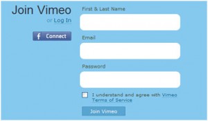
Don’t: Go on and on (and on) about nothing
If you have a personal blog where you write about your life, that’s another thing, but to randomly post about what you ate, or where you went yesterday on your business website will certainly take people away.
Do: Focus on content copy-writing
Text within content should be as short and exact as possible. If you have trouble writing content that attracts readers toward your website, hire someone. It is as important things as the design of your blog/website. Choosing a right words for web element (such as sign up form, page heading, etc) can improve subscriber rate.
Example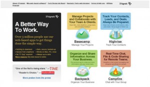
Don’t: Stuffing your pages full of keywords
Neither Google nor your readers are stupid. If your page contains stuffed keyword, you will be penalized for that. Writing flow should be natural and should have keywords only at exact place they really belong.
Do: Proper navigation must be set
Navigation element should be proper as it help visitor to scan and locate your web pages. It should be easy to spot and use.
Example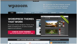
Don’t: Force your readers search to find something
Your reader will not spend trying to locate your contact or about page. Place important things at easy to locate place. For things that doesn’t require strong emphasize, use a search box for them.
Do: Optimize load time of your web page
You should optimize load time of your web page; it should take around 2-3 seconds. You can do this by compressing CSS files, using Google hosted JavaScript files and ensuring that your web page is coded and designed keeping optimal speed in mind.
Example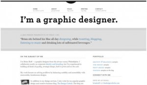
Don’t: Making everything on your page an image
There is no need to make the text blocks of site images. Making your website background more in size is also a reason to load your page very slow.
Do: Pick the right fonts and their sizes
Typography is one of the important aspects of web design. Make your section titles with the right font and sizes; this will greatly impress your visitors. In general, you should use one main font for content and another one for a page titles.
Example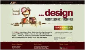
Don’t: Using numerous fonts in different sizes
Using 10 different fonts with different sizes will make your web design ugly. So never do it.
Do: Make your page visually attractive
Your web design is your brand. Make a first impression on your reader through your web design; he will be a returning visitor. Utilize textures/gradients that give depth and draw attention to the beauty of your design.
Example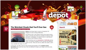
Don’t: Use scraps and hope it will work fine.
Do not excessive use any graphics, multimedia or any other within web design. Clever use of any element is appreciated and only it will make your design visually attractive.
Let us know your opinion, comments or guidelines
We’d like you comment, opinion or guidelines about our articles. We’ll make sure to respond your questions because you are important here at Web Design Fact.
nice