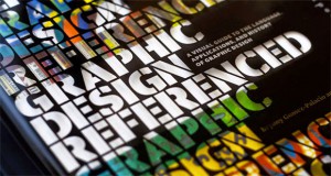
Since graphic design is essentially a form of visual communication, it is important to be familiar with the building blocks in order to convey your message in the most effective means possible. Many effective examples of these 5 basic principles can be found by browsing design agency websites such as simple.com.au, however if you’re looking for the fundamentals behind good design read on:
Alignment
Having elements in a design align is a powerful way of creating a sense of orderliness and organization. When considering the alignment of text and elements in a design be sure to pay equal attention to the top, bottom and sides and also both horizontal and vertical axis. While the alignment of elements to one another is a general rule, rules are made to broken. The purposeful misalignment of an object or element can draw in attention to highlight a feature.
Balance
In simple terms, balance usually means the weight of one side compared to the other. This can apply in graphic design as well, but there are others ways to consider it as well. Balance can be symmetrical, asymmetrical or radial and can even mean the distribution of completely different elements across the page. For instance, graphic elements dominating one side of a page and text the other or a spiral with text balanced throughout.

Contrast
Contrast can be incredibly important as graphic design principle as it tends to grab attention. It can also be used to isolate objects or do the opposite by bringing the eye directly to an element on the page. Contrast works great with black and white, but can also be very effective with strongly contrasting colors, textures, shapes and more. Be careful, don’t make the common mistake of using contrasting text that is difficult to read against the background.
Proximity
The principle of proximity deems that related elements should be grouped together for better organization and a smooth layout. A common example of proximity is the navigation bar on a web page. These elements don’t only look similar, but have related purposes and are more functionally practical grouped together.
Part of effectively implementing proximity is the consideration of white space on the page. White space serves as a buffer to show delineation between groups of elements. Proximity can also be used to create a perceived difference in purpose or size of various elements.
Repetition
Using repetition seems easy, but can actually have undesired effects if carelessly slapped on page.
Repetition can help draw attention to a certain element or create unity between multiple elements. This can be repeating lines, words, colors or other graphics. Repetition is found in text books, web pages and is a great way to show that two things are related whether they be different pages or elements. A considerable function of repetition is provide a level of consistency to a design.
Graphic design has evolved to become an integral part of nearly every form of visual communication. The combination of a strong understanding of the foundation and principles underlying design along with a dose of tasteful creativity can go a long way towards effective marketing.

Great i really liked them all.
These are fantastic tips. The concept of contrast is one that many people forget. It’s also very important to make sure the contrast isn’t gaudy in nature. Making text and images stick out is important but avoid clashing colors.
I like your post! Thanks for describing graphic design in such detail. This is a really useful article.