 While pointing to the web or blog design many people use a word – “Quality”. But a lot of them don’t know that what does the quality stands for in web design industry. And how to achieve it. Don’t worry; we will take care of it. Here we have an article number one in which there are few ways like color scheme, typography, spacing and pixel perfect details method which are useful to achieve quality within web or blog design. You can use these methods to perfect your own style. So be clever and remember these points while designing a blog or website.
People often make a huge mistake when they use colors their personal taste. Whenever designer comes into a situation where he have to decide upon what colors look good in a design, he always should be on the brand, and building a theme and mood using a color blending.
Examples of dazzling uses of colors
Real colorful use of colors – “oypro.com”

This website has a stunning blend of colors which makes boring subject like real estate as interesting. But this design proves that you still have a corporate looking website, without keeping content simple, flat, and gray.
Maintaining relevancy in colors – “summer.tnvacation.com”
Within this design there are a lot of different colors in act, but all of them are relevant. Good quality designs have a color mixture that is relevant to the service or product for what they are designing for.
Diversity in backgrounds of design – “saturized.com”

Best backgrounds for design are those that have a bit of mixture, diversity. Here we can see that the gorgeous orange/red color is subject to all sorts of lighting effects and gradients. It gives an extra something to the background, and stops it from appearing stale and flat.
Tips for using color blending in design
Research –
A boring theme doesn’t have to have a boring color scheme.
Diversity –
Try using gradients, patterns, brushes on your colorful backgrounds. Color only doesn’t impact for looking good.
Attach to a theme –
Use only colors that are relevant to product or service.
02. Typography
Content plays a vital role while determining overall quality of website. But they are not written by designer. So it is very difficult to make these contents eye-catching. Hence clever typography makes a difference.
Examples of clever typography
Large and beautiful on website – “netsetter.com”
Titles are imperative within design, particularly while designing a blog. A latest trend in web design is to use big & bold fonts for titles. Into this example, you can see how the title generates a lot of white space around it, and obviously it’s very easy to read.
Leading and spacing with text in website – “viget.com”
This example is really good to show the importance of typography within website. Into this larger sized font used to create and open space. Designer has used the thin, crunchy font to create more space created in that area. The real typeface itself is very slick, and is a wise selection of font. Other thing which must mention is line height (Leading) which means the increased spacing from the default value between each line of text which creates a lot more space and makes the text much more clear.
Fonts to fit mood – “webdesignledger.com”
Into this example a very wise choosing of fonts is done that invokes a similar mood of entire website which is retro and warm. This is major cause for its success. The two choices of typeface (Georgia for the titles and Helvetica for main content body) in this example are very smart and really set the mood of the design.
Tips for clever use of typography into design
Make it clear to read –
Make titles big and bold so these can be more clear and readable. Don’t hesitate to do so.
Think about spacing –
To improve readability greatly use spacing.
Make it relevance to design –
Make sure those fonts you are going to use are relevance to design. Choosing right font can be done through trial and error.
03. Spacing
Wise use of spacing is really a major factor while tolerating a quality of web design. If you pay a close attention to how certain things are spaced out and lined up can really help your design to stand apart from crowd. The way to getting spaced right is to look over at all elements of your design.
Examples of clever spacing
Great spacing on website – “good.is”
A very clean appearance is noticed in this website. Designer has allowed a great amount of spacing around images and text.
A very well spaced out website – “digitalmash.com”
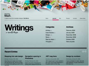
Digital Mash is stunning example of spacing as it is more gorgeous and a lot more clickable by users.
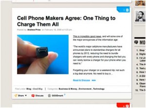
Plenty of spacing in website – “daily.creattica.com”
If you have few lines of text within a page, it doesn’t mean that you cannot use a lot of space. This website is really a good example that proves it.
Tips for effective spacing
Use grid system –
Grid system can really help you to understand where you have to give enough space.
Don’t give up trying –
You should always try until it seem that enough spacing is given to you design elements.
Remembering white space –
Keep in mind that white space in design is not always a wasted space.
04. Pixel Perfect Detail Method
Pixel Perfect Detail is the method of which pays a close awareness to lines, edges and borders. Instead of having a simple line, add some small details like subtle gradients, or something as a plain 1px shadow or highlight which will really make your design gorgeous.
Examples of implementing pixel perfect details within design
Take a close look at website – “envato.com”
![]()
![]()
The green bar has a 1 pixel lighter green line on the border in this design. And below it a soft gradient shadow on the within of the box and makes a 1px clear white border at the top.
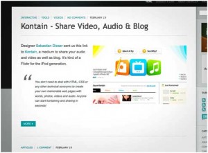
View details on website – “tutorial9.net”
![]()
![]()
Addition of a simple 1px highlight to the top, a little different look is achieved by tab. A well as a drop shadow on the camera icon, a shadow emphasized on the white area, and a 1px highlight on the top of the navigation bar makes this design very different and having quality.
Tips for implementing pixel perfect details method
Make it slight –
Place small details within website elements.
Determine pixels –
Elements like borders, gradients, lines or shadows can become more effective although they are not huge.
Check result –
Tally your result before and after applying effects. So you will easily find out how much effect you have to apply within web design.