 There are a number of elements whose perfect blending makes up a great web design, but probably one of the most ignored is whitespace. Every design has whitespace, but the problem is that – it is not given sufficiently given to every design. This happened due to the fact that inexperienced designers and their clients see whitespace as empty space and therefore a waste of valuable screen real estate. But in reality, whitespace might be one of the most important parts of your design.
What is Whitespace?

Although its name suggest, whitespace doesn’t actually have to be white. It gets its name from the early days of graphic design where most printing was done on white paper. Whitespace is simply the empty space between and around the elements of a design or page layout. It can contain: space around graphics and images, margins and gutters, space between columns, and even the space between lines of type. Whitespace is also referred to as “negative space around design elements”.
Whitespace is made of nothing, but shouldn’t be treated that means. There are several benefits that a generous dose of whitespace can bring to a design. Simply by increasing the space between elements in a layout, designer can achieve more neat look, and by adding more whitespace into a web design’s typography, content becomes more clear.
Elegance and Sophistication
In print design, paper is a valuable resource and clients will usually want you to use every pixel of it. After all, it costs them money and they want that their money should worth. Similarly in web design, there is a set dimensions and represent limited space in which a message can be presented by displaying text and graphics.
By adding more whitespace around element, you’re saying that your content is far more important than what the rest is. Luxury brands use this concept to convey an image of sophistication and elegance.
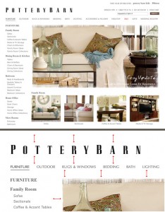
Let’s have a look at these two furniture companies, for examples. They have lots of whitespace around their content, even their logo uses large amount of whitespace between each character.
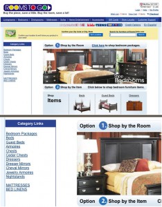
Notice how the list of category links is crammed up against the left border. Things like this can make a design look sloppy and unprofessional.
Again have a look at these two well-known brands – Apple and Microsoft. You will notice that Apple, being the essence of elegance and sophistication, uses plenty of whitespace. While the Microsoft home page is a bit more crowded. This is right in line with each company’s general brand perceptions.


Better Readability and Usability
On a micro level, whitespace plays a major role in typography and even usability. Text that is restricted with minimal line spacing can be very difficult to read. By adding more whitespace between lines of text, content becomes easier to scan and read.

Below is an excellent example of whitespace within text. The large amount of spacing between lines makes the content a joy to read.
Micro whitespace not only makes text easier to read, but also helps divide blocks of content from each other. This can help a user differentiate where content starts and stops.
The example below shows how whitespace can separate within the various blocks of content so that they stand out from one another. A larger amount of whitespace is used to separate the content blocks, then a smaller amount is used between the paragraphs within each block.

Develop an Eye for Whitespace
Like many other aspects of design, there is no set of guidelines or rules for calculating the right amount of whitespace. All designs are different so the amount designer should use may vary from project to project. The best ways to learn is experiments and study the work of other designs that seem to be getting it right. Finally you will develop an eye and feel for what is the right amount of whitespace. So good luck!
Very well written article… Thanks for this!