 Flat Design or Flat user interface (UI) is a hot topic because designers are wondering if it is the wave of the future or a passing fad. The principles and style of flat design is just the opposite of skeuomorphic design, which has a 3D appearance. Flat design is not necessarily the best solution for every design application. It depends on what the designer is trying to achieve and communicate.
Flat Design History

In 2012, Allan Grinshtein of LayerVault established that flat design is not a passing fad but the future. The flat style simplifies interface elements and removes extraneous decoration including textures, gradients and bevels. The focus of flat design is hierarchy with a crisp, clean design. According to Grinshtein, to create an elegant interface, a design must have the most impact while using the fewest elements.
Minimalistic interface suits function better than complicated interfaces. The new Apple iOS7 has dropped its skeuomorphism for the flat design user interface. Rather than creating a pine bookshelf or yellow legal pad with blue lines and red margins, flatness has won. The clean, simple, two-dimensional graphics have layers of flatness that seem to float on top of each other. Some are translucent, so the under layers can be seen. Users no longer need buttons to look like buttons. They know what they are. Color, boxing, outlining, shape or typeface are elements of flat design that make buttons cleaner and simpler.
Principles of Flat Design
For some reason, flat design is controversial among designers. If good design is useful and works, then there is no right or wrong answer to the question of which is best, flat or 3D. The main characteristics of flat design are:
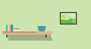
• No visual cues and extra details – the style is two dimensional using shapes and colors. There are no embellishments such as embossing or drop shadows.
• Simple user interface elements – each shape stands alone with square or curved edges. Rectangles, squares and circles are the most common shapes used. Colors are bold to encourage use. The design agency in Perth understands that simple elements are not necessarily simple design. Flat design concepts can be complex.
• Typography to the forefront – typography becomes a very important part of flat design. Typefaces should match the design scheme. San serif type is available in many variations and weights and works the best with flat design. Typefaces should support the message. They communicate the message, are a navigational tool and give instructions of what to do next. Make sure every word counts. A novelty font can be added as a highlight or art element but shouldn’t dominate the design.
• The importance of color – Vibrant hues are required for flat design to be effective. Primary and secondary colors are the most popular. Flat designers tend to use a broad color palette that combines hues that were previously not used together. Sometimes colors are emphasized even more with the use of black or grey. Bright tones and super saturation are the keys to color for flat design.
• Minimalist design approach – since flat design is already simple, the minimalist style of reducing the graphic to the simplest of shapes works well.
• Not truly flat – some designers use a few effects in their flat design to add flexibility to the overall design. They may put gradients or drop shadows. Usually, one effect is used in one project. This adds a bit of texture and depth, but some designers feel that combining two styles means there is no style. Some designers focus on content hierarchy within the page so that elements don’t intersect and the overall page flows naturally. Color and box content is used to create this harmony. The various boxes of text will tell the user how to interact with the page. Buttons may have flat background colors or pictogram and shapes. This is why text and color are the most important tools for flat designers.
Some guidelines to follow to achieve Flat Design
• Removing texture, shadows and stitching should not remove any important content from the page. Flat design should solve problems, not create confusion.
• Two dimensional interfaces can stand out because they look simple to use and focuses the user on the website content. However, for some websites, the 3D appearance enhances the content.
• The hierarchy of the page can be expressed with the use of shapes, pictogram, color and text.
• The selected color scheme must use contrasting and complementary colors well. The world is flat again for the time being, but it may not always be so. The design agency in Perth remains on the cutting edge of the latest web design trends.
About the Author
 Daniel Johns writes for a Bouncing Orange, a leading Design Agency in Perth.