 When it comes to optimizing your landing page to get the best results, it sometimes seems like you’re taking a shot in the dark. Does the copy need to be reworked? Are your images compelling enough, or are they the right choice for your demographic? A/B testing will help you iron out these wrinkles. But before you begin, download Google Analytics and run through this comprehensive list of tips to help you get to the best starting point possible. If you find yourself struggling to understand your analytics, use a Google analytics guide to help you get a jump start.
Learn about your customers
This is probably the most important thing you can do to make your landing page a success. Every statement should revolve around what your product can do to enhance their lives, and every image should appeal to their interests. Speaking of which;
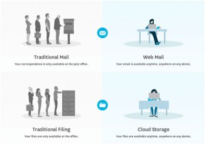
Use relevant images
Analyze your images for these three components:
1. Do they appeal to your target demographic?
2. Do they help to explain your product?
3. Do they evoke the customer satisfaction your audience will get when they choose your product?
If you have positive answers to at least two of these questions, then you’re on the right track. For example, check out how Xero utilizes images in their cloud computing landing page. Images aren’t over-designed, busy or pointless. They simply compliment the written content and help clarify the desired points.
Make the page flow in a logical and attractive way
Every component of the page should be arranged in a hierarchy that leads the viewer to the call to action. Apply visual weight to important sections and phrases. Place your form on the right-hand or lower side of the page, so that the user doesn’t feel subconsciously pressured to fill it out before they’ve read your pitch.
Within this flow, pull out scan-able portions
Most of the people on your page won’t want to bother reading word for word, so make it easy for them to get your point by highlighting key phrases with bolder font choices. Use sub-headers and lists to break up sections and further emphasize information.
Make your form as simple as possible
It’s tempting to ask for extraneous information in your form, but save that for later, when the viewer has already opted in. Remove any fields that aren’t strictly necessary.
Use videos with care
If your product is complex enough to need it, use a video presentationor an audio clip to make sure your audience can quickly and easily understand its function. These can be great tools: for BeCouply Dates the addition of a video had a bigger positive impact on their conversions than any other tool. But also allow people to pause any videos or audio, and give them alternate ways to find information.

Make sure the page loads quickly
Another consideration with videos, audio, or other fancy effects is that your page needs to be just as speedy as a plainer version. Your effort isn’t going to be appreciated if the user clicks away because they’re bored of waiting for your page to load. To check your site speed, you can use a simple
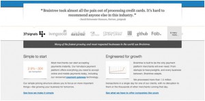
Give the user a sense of security
Make sure that you’ve assured your users of their privacy and security. Offer guarantees or free trials, when applicable. Tally and display social media shares, or endorsements from respected publications, like Braintree does below:
Give the user a pressing reason to accept your offer
This sense of urgency can be conjured up in several ways:
1. Refer to a limited amount of time your product is available.
2. Refer to a limited number of items the user will receive (like a promotional freebie or discount).
3. Describe your product as the unique solution to your audience’s problem.
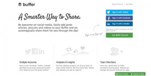
Try different kinds of sign-ups
After Buffer switched from an email to a social sign-up process, it increased their conversions in one day by 30 percent. Because social sign-ups don’t require filling out an email and creating a password, they’re easier, and therefore more likely to produce conversions. If this doesn’t suit you needs, consider asking for just a username, and letting the viewer fill out their password at a later date.
Of course, every trick you might try will have varying success depending on your unique situation and product. In this discussion of what tweaks generated the most conversions for start-ups, the advice is all over the board. In the end, every decision should come down to what appeals most to your target audience.
About the Author
 Luke Clum is a Seattle based graphic designer who is crazy about videography and alpine climbing.
Website: Luke Clum