 CSS3 is helping web designers and developers to make their designs more productive and innovative. But still CSS3 is not supported by all browsers, so we can not always relay on it. But we can implement it to enhance certain facets of our designs. However, CSS3 is not only used for easily and quickly creation of websites, but also for better sites than we ever could. Here are some examples of how we can use CSS3 to improve the website/blog. These examples explain realism within web designs with CSS3.
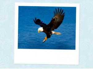
Polaroid images are the iconic and great way to display photographs. Polaroid image having white border at all sides and a thicker border at bottom, is boost appeal of your website. But we ca still enhance it with CSS3. Here is how. This example is best viewed in latest version of browsers (such as Safari, Firefox, Chrome, etc). You can insert an extra layer of depth with the addition of drop-shadow and transitions.
border: 15px solid #fff;
border-bottom: 65px solid #fff;
-webkit-box-shadow: 1px 1px 2px rgba(0, 0, 0, 0.1);
-moz-box-shadow: 1px 1px 2px rgba(0, 0, 0, 0.1);
-webkit-transform: rotate(1deg);
-moz-transform: rotate(1deg);
}
img:hover {
-webkit-box-shadow: 6px 6px 8px rgba(0, 0, 0, 0.1);
-moz-box-shadow: 6px 6px 8px rgba(0, 0, 0, 0.1);
-webkit-transform: rotate(1deg) scale(1.05);
-moz-transform: rotate(1deg) scale(1.05);
}
A slight shadow gives the idea that is fitted on a flat surface and by balancing and increasing the size and positioning of the shadow on a hover action; it creates an illusion that it has been lifted up from the surface.
Physical Buttons
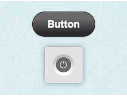
As we know that web is an interactive medium and buttons are a type of interactions. Then why buttons are behind when in comes to interactivity or creativity? So, we have makes a buttons in CSS3 that behave like physical one. To obtain a circle in CSS3, we have set a width and height, and define border-radius as half of those values.
width: 30px;
height: 30px;
-webkit-border-radius: 15px;
-moz-border-radius: 15px;
border-radius: 15px;
text-indent: -9999px;
border: 1px solid #696969;
background: #696969 url(power.png) no-repeat 6px 5px;
}
The active status utilizes gradient property of CSS3 to make a gradient that is dark at the top and lighter color at the bottom. To keep the background image of the power button, include it in the background property and split the gradient values with a comma.
-webkit-transform: scale(0.97);
-moz-transform: scale(0.97);
background: url(power.png) no-repeat 6px 5px, -webkit-gradient(
linear,
left bottom,
left top,
color-stop(0.13, #696969),
color-stop(0.72, #2a2a2a)
);
background: url(power.png) no-repeat 6px 5px, -moz-linear-gradient(
center bottom,
#696969 13%,
#2a2a2a 62%
);
}
The lower-level border also uses CSS3 gradient to acquire the full effect. The border class is utilized to a div having the button.
margin: 0 auto;
height: 42px;
width: 42px;
display: block;
background-color: #fcfcfc;
-webkit-border-radius: 21px;
-moz-border-radius: 21px;
border-radius: 21px;
background: -webkit-gradient(
linear,
left bottom,
left top,
color-stop(0.13, #fcfcfc),
color-stop(0.72, #c0c0c0)
);
background: -moz-linear-gradient(
center bottom,
#fcfcfc 13%,
#c0c0c0 62%
);
-webkit-box-shadow: 0px 1px 1px rgba(255, 255, 255, 0.6);
}
DVD Cover Animation
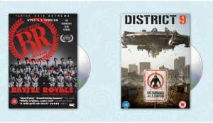
CSS3 has a built-in animation module that is full with fun. This can do things that CSS couldn’t ever.
-moz-transform: translate(50px,0) rotate(330deg);
-webkit-transform: translate(50px,0) rotate(330deg);
transform: translate(50px,0) rotate(330deg);
}
Here is the animation that is used to animate DVDs when mouse is hover on them.
-moz-transition: all .5s ease-in-out;
-webkit-transition: all .5s ease-in-out;
transition: all .5s ease-in-out;
}
The above code is demonstrated by Andy Clarke at For a Beautiful Web. These tutorials are originally authored by Inspect Element. Whenever you found something interesting on web, you just have to look the source code to examine how it works and learn from it. This is the best practice to be master in CSS3 or any other programming language.
Here are the demos of above tutorials:
Polaroid Image
Physical Buttons
DVD Cover Animation